Monday 30 April 2018

Group Crit


What are the intentions? 

Brand the exhibition by visualising the concept of a mixtape and cassette format.

How can this be achieved?

Using visual references to the era of the cassettes 80's and 60's, a retro style. Exhibition set up plan has the aesthetic of a cassette format. Also creating a warped visual aesthetic to the type and imagery to visualise the warped audio associated with a cassette.

How does this answer the brief?

By referencing a relatable concept to the context of the exhibit. The cassette works as a musical element to visualise the micro-genres. Using the idea of mixtape as a theme to the exhibition also answers the brief by justifying showcasing different responses to micro genre's visually and aesthetically.

Feedback from the Crit based on Initial Ideas:

- Concept: Format of cassettes & Mixtapes - referencing warped audio 

- The mixtape references different responses and approaches to the brief. 

- The mixtape means we can consider mixing aesthetics to bring the concept together

Why? (Thoughts)

Have a clearer concept: so the target audience understand the design decisions and background of the exhibit.

- Consider how cassettes were named?

Why? 

To gain further background knowledge and contextual information relating to the concept

- Consider a more mechanical element to the design - possibly in way finding?

This relates more clearly to the concept of a cassette format by using format and the construction of the cassette as a visual element.

- For the catalogue consider one folded page format with a front back and inside.

Why?

Works well to link the production and design of the catalogue with the concept 


Initial Catalogue Layout:


Group Meeting

Concept: What is research based on? Does it communicate a core idea? Is it clear and simple? 

Branding Strategy  : What are the rules? How do you justify these?


TYPOGRAPHY : Logotype / Typeface 

IMAGE : Poster, Invite, Social Media 

LAYOUT : Grid, Format 

COLOUR : Specify colours - Pantone etc. 

PRODUCTION : Materials, Methods used 


Typeface : Could the type be warped to visualise the aesthetic of the audio on cassette being slightly distorted 

Logotype: Reel to Reel with C-60 and C-90 names for each room, this references the actual context of cassettes

Colour Scheme: Reference CYMK to fit with C-90 

Other methods of Promotion: 

- Tote Bags 

- Stickers 

Exhibition Plan: 

Refreshments or stickers on a table as you go up the stairs. Birds-eye view cassette layout. Genres split onto each wall. Boards dividing the space with alternate 


To Summarise

Title : Reel to Reel / C-60  

Imagery : Photos from the 60's  - when tapes were created and Warped to represent the warped sound of cassettes.

Grid : From a JCard / Floor plan exhibition layout 

Layout : Cassette Floor Plan categorised by genres 

Wayfinding : Vinyl Stickers on floor ( latimes.html )


ROLE : 

Catalogue : Elouise and Alex 


Initial Layout : 

Taken from the exhibition layout 


Or 

A double sided spread one side illustration other side information - A Map


Sunday 29 April 2018

JCard & Flag Development

JCard Front


JCard Inside 

This idea develops a high contrast two colour design black and red to capture the explicit censored nature by using a contrasting colour or red type. The design also uses characters I created by making my own typeface to act as the censored pixelated shapes. The imagery references pop reggaetons heritage and link to Puerto Rico. The photo also references crime in this area to act as an explicit image that could be censored. The enlarged type characters hide explicit elements of the image such as guns and weapons carried by the Police. 


Flag

Once I have received peer feedback I will decide which of these two designs I want to develop. This will push further development into decided whether or not to include imagery or keep the design purely typographic. Peer feedback will enable me to make this decision more effectively and be more decisive  and ensure I make the appropriate decision for further development. 


Saturday 28 April 2018

Group Meeting

We met on Friday afternoon to discuss further ideas for the branding of the exhibition although Zoe and I were the only members of the group present due to absentees and an induction. Zoe and I initially discussed some alternative ideas for names, the two favourites being reel to reel and peak or peaks as these names were considered relevant to the theme we discussed of evolvement of micro-genres and relatable to the context as cassettes contained reeled tape. 

After discussing names we began to think about the exhibition plan or layout. We came up with the idea of creating the layout of the exhibition set out like a cassette from a bird's eye view. This links the exhibition in context to the content of the exhibition - cassettes. We also considered alternative heights and placement of objects to visualise the 'peaks' throughout the micro-genre history. This idea can be illustrated well through a range of colours but we have not decided on a colour scheme yet. 

To summarise: 

- Peak placement of objects 

- Cassette exhibition layout 

- Wide range of colours used to visualise this theme 

- Possible line graph showing main genre peaks as vinyl stickers around the walls of exhibition room

- Arranged in chronological order 

- Peak varied placement of wall items for the exhibition 


Initial GIF idea for part of the social media campaign:


Typographic Designs

For further development I experimented with an alternative approach using purely typographic elements. The first example shows a typographic design for the flag designed using my own typeface I created in Excel. The colours use a range of shades of the hue grey ranging from dark to light. Harmonising alternative hues works well aesthetically. 

Initial Idea 1


This colour scheme offers a slight twist on the generic black and gold colour scheme often associated with my micro-genre, pop reggaeton. The layout of this composition works well and is very fitting for the context as it can be related to a single stripe seen in some European flags. 

Initial Idea 2 


This idea uses layout again in a context relating to European flags. Using a purely tonal colour scheme which works well to harmonise all the typographic elements. This layout effectively uses contrast between negative space and typography to produce an interesting outcome. 

Initial Idea 3 


For further development could this design experiment with a contrast between my own type and existing typefaces. Perhaps also using a more high contrast colour scheme. 

Initial Idea 4


These ideas experiment with creating a pattern with larger scaled type and use the colour scheme of the Spanish flag making reference to pop reggaeton's heritage. The other example uses a generic colour scheme associated with 'reggae' red green and yellow.

Initial Idea 5


This idea plays with the idea of a slanted type baseline in the layout of this design. A slanted baseline type layout can be seen on many existing pop reggaeton album covers. This could be developed further by finding a more suitable colour scheme.  

Friday 27 April 2018

Digital Preparation of Positives for Screen Printing Session 1

Techniques apply to silk screen printing but also apply to print. 

Photoshop skills required: 

- Using layers 
- Colour modes
- Adjustment / layers
- Simple selections 

- Allows you to visualise onscreen how the screen print will appear and print two positives. 

- The first thing you must do always is desaturate the image so the image still supports colour. 

- The adjustment layers used include threshold. This simplifies the image to produce pixels only in black or white.

- Levels adjust the image to appear nearly like a stencil. Hue and saturation adjustment allows you to simulate the ink that can be used for screen printing. 

- Using a clipping mask can apply this to one layer or a border between layers by pressing 'alt' and clicking 

- Consider the transparency of printed ink layers that overlay you must use the multiply layer mode (Transparency ink)

- Overprinting : how inks work together in the printing process 

- Consider the production process whilst working digitally - transparency and interaction of inks 

Half Tones 

- How to reproduce tints of an ink during the print process. 

- When the positive is printed a half tone screen is applied

- This creates the illusion of tones through smaller and greater spacing 

- Must consider frequency (spacing of the dots) 

- Frequency no larger than 50 

- Angle of 15 degrees 

- This avoids creating interference patterns (moire patterns)


- Save background image as a TIFF in grayscale mode 

- A3 appropriate laser printing positive 

- Use Illustrator press file and place 

- Image is a composite - we see everything that will print 

- Doesn't change image half tones added during the print process 

- Bitmap permanently changes the image 

- Bitmap image must first be in greyscale mode

- To maintain detail increase resolution from 300dpi to 1200

- Select option Half tone screen 

- Using the bitmap technique print in digital print don't use laser printer, as this will create a moire pattern 

Using alternative techniques to create the same outcome

CMYK & RGB Mode 

CMYK
- CMYK for print
- Ink on paper
- Subtractive 
- Produces colour during the print process

RGB
- for screen 
- Light of monitor 
- Additive 


Using CMYK 

- Using Channels is how photoshop stores information about the image 

- Mainly selection and colour information

- Shade of grey is linked to the shade of cyan 

- When displaying two channels at once to see colours contained 

- Select file print in Illustrator in Output, Mode select Separations

- Is possible to print in CMYK 

- Each angle needs to be different for each ink 

- Angles : 15, 75, 105,155

- Frequency : max 15 lpi 

- Splitting Channels applies a grayscale to each channel 

- This allows you to apply Bitmap and Halftone in that way 

- CMYK the channel becomes the positive 


Colours used in commercial print 

- CMYK : four process inks are over printed in order to print a colour 

- Spot : one spot ink is used to print a colour (Pantone colours)

- Spot colour used for the accurate representation of colour particularly used in branding

- Using fewer inks or (spot colour) makes production cheaper

- Spot inks are most relevant to the screen printing process 

- 14 base inks & transparent white in Pantone colour selection 

- Each pantone swatch indicates base colour mixture 


Channels in Photoshop

- Select new spot channel from channel option bar 

- Select Pantone solid uncoated 

- Type in the number of the colour swatch 

- Cannot work with colour within a channel

- Can alter the opacity by altering the solidity, opaque: 100%


Using knock out technique 


 Select and copy and paste image layer into channel 
Save image as TIFF file 

Getting positives from this image
Open Illustrator 


Thursday 26 April 2018

Group Research Ideas

GROUP RESEARCH 
INITIAL IDEA FOR VISUALSTRATEGY
RULES AND BRAND GUIDANCE FORMATS

CONCEPT


BRAND STRATEGY 


LOGOTYPE 


CATALOGUE 


EXHIBITION LAYOUT 


POSTER


PRINTED INVITE 


SOCIAL MEDIA 

- How to curate it
- Galleries 
- Colour to black and white 
- Strategy 
- A countdown releasing things 
- A talk from a designer or record label
- Give the first 20 people who turn up something - stickers? 

Best Examples of Strategy and idea applied 


OK-RM - Under the same sun Branding 


Exhibition considerations:

  • Design is a face paced environment 
  • Intuitive process
  • Work with different disciplines 
  • Approached from different point of views 
  • Curated to an experience 
  • Solve the problems and scenarios 
  • Responsibilities within the project 
  • Treat as a fictional space 
  • Narrative layer - experimental 
  • Fact meets fiction layer 
  • Scenario layer 
  • Consider specifics - characteristics or characters 
  • Deceptive, devious, stylist 
  • Publication acts as a guide 
  • Priming a space suitable to the exhibition such as relevant videos 
  • Convey a range 
  • Simultaneously viewers not knowing what to expect 
  • Work in a range of scales 
  • Different objects have different effects
  • Does the work interact with each other 
  • Captions containing numbers no name 
  • Explore language and meaning through text 
  • Feeling or attitude to language used 
  • An exhibition creates an effect for the audience 
  • How can it be connected to feelings fear and love 
  • Mood boards that inspired the curation 
  • Thesis of exhibition 
  • Research materiality 
  • Investigate the perfect sampling and test it
  • Forums and workshops on how materials relate to place of exhibition 
  • Build diagrams of project - could this be an outcome 
  • Do the materials come together?
  • What is the structure of the exhibition?
  • Consider alternative materials they are cheaper

Refined Typeface Design

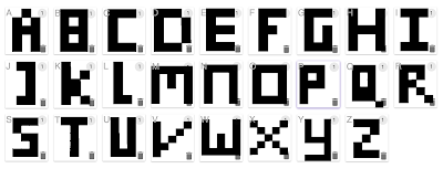
The final typeface design was designed using cells in Microsoft Excel to create a typeface that visually has the aesthetic of pixelated block shapes to represent the idea of explicit and censorship. For further development I will experiment putting the type in context to produce purely typographic design ideas for both the flag and JCard. 


The type can be used to act as the censored areas of the design instead of block shapes the type could be used on a large scale. Hence harmonising the design elements of imagery and type far better. I will use my own typeface in contrast to a basic more simplistic typeface like Helvetica Neue Ultra Light or Futura. 

Below are text examples of each typeface I created the final design is the most successful and relates best to my chosen theme and genre.