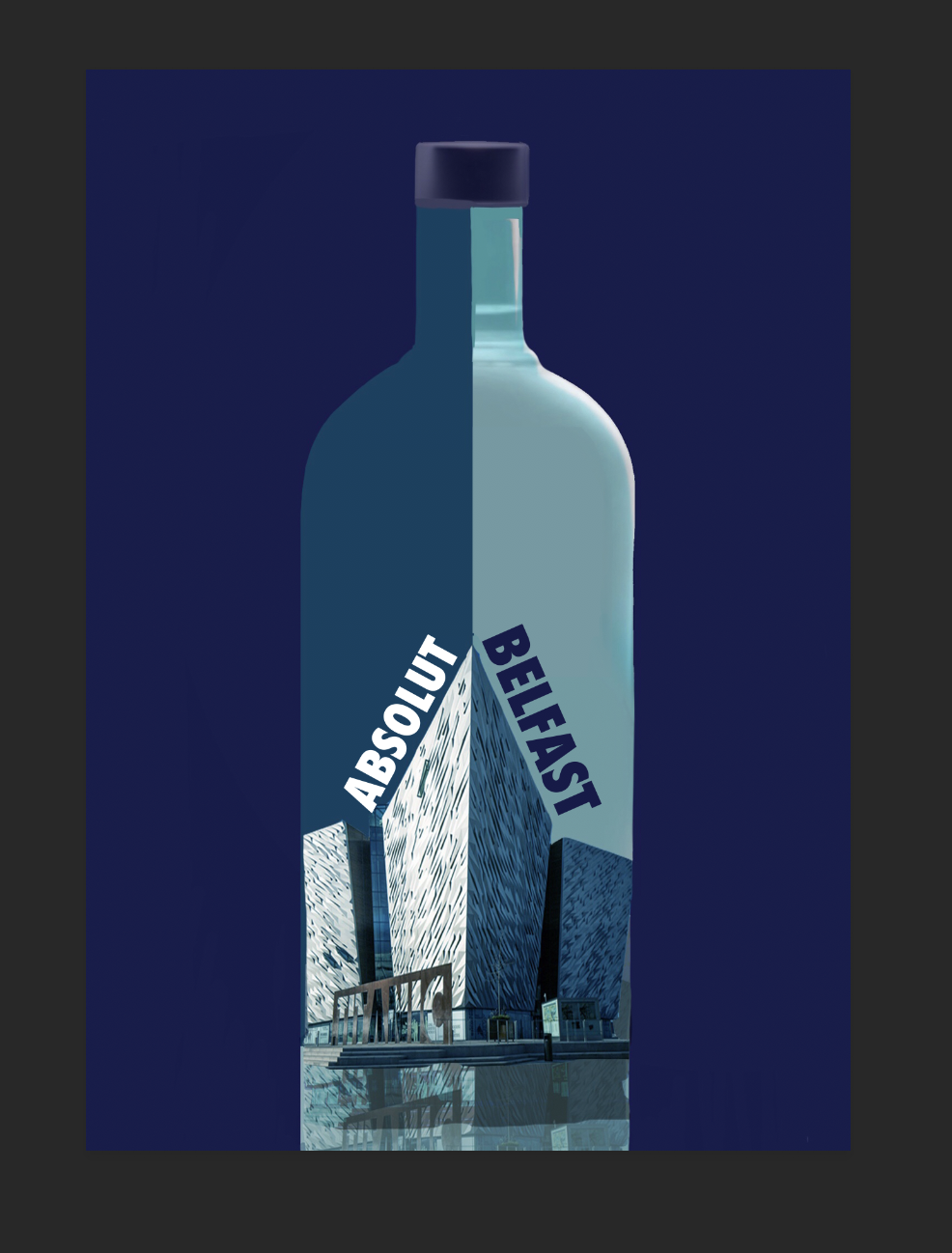
The design development stage enabled further experimentation with type and layout to produce a refined outcome. A number of type compositions worked well so it was difficult to refine. However feedback made this decision easier and the design was developed by incorporating an existing tonal shade of blue green instead of a darker blue whilst the type was positioned in different locations to find the most appropriate layout and format suitable for the design.
The colour choice also encouraged thoughts into production. Perhaps the green blue didn’t need to be opaque colour and could incorporated into the material, such as a green blue frosted glass. This could give the design and appearance of the bottle an eye-catching appearance and feel. Something that could create a point of difference and attract customers.
The use of colour instead of negative space also creates a unique design which stands out but is still fitting of the brands bold and colourful characteristics. This design would also stand out this way against competing brands such as Smirnoff and Glenn’s. In particular it would stand out against aesthetically pleasing gin bottle designs which often stand out to customers. However frosted glass would be an interesting material to consider in the production of this design. This would still show the contents of the bottle but through a transparent matt finish material. The contrast of half matt and gloss would be interesting but may be difficult to achieve or manufacture.
Initial Ideas


Developed Ideas


No comments:
Post a Comment