Eloise and I focused on refining the booklet layout today and getting feedback from the group. This was important to consider other group members opinions before further refinement.
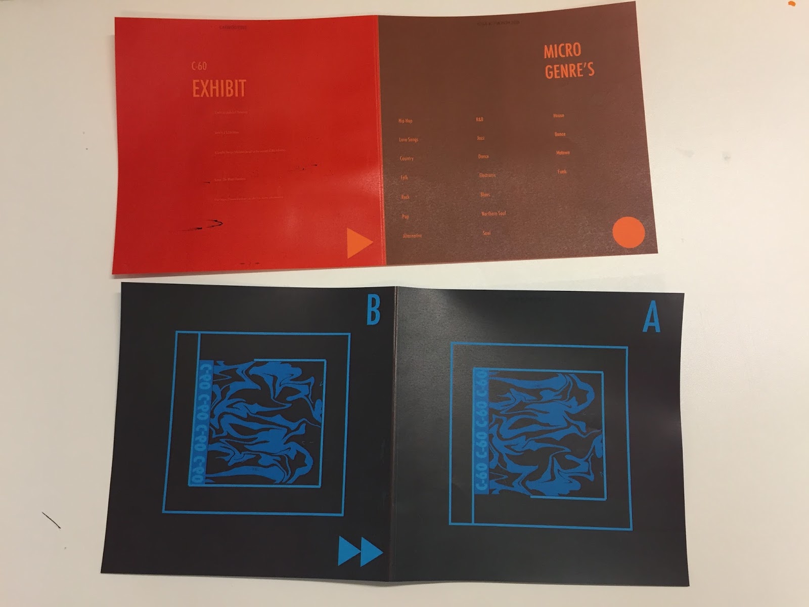
Below shows a coloured copy of the catalogue and the finalised layout without the map insert. The group liked both layouts so we decided to combine them by creating an insert of a map as a view finding method to navigate around the exhibition.


Production
Below shows images of us experimenting with alternative production methods. This included a monochrome and colour photocopy. Whilst experimenting we used coloured paper stock to see if this improved this aesthetic instead of printing a block background colour. The black and white photocopy created a nice aesthetic that looked more refined than the colour copy when printed on coloured paper stock.
However, after presenting this to the group and discussing it further we decided it might not be fitting enough to the brand. This was because all the other design work follows an exact colour scheme. For further refinements we will include the finalised imagery, image, logo and logotype. We will also print on a matt finish off white or white paper stock to better reflect the brand and it's colours.


Colour Photocopy on coloured paper stock:
Black and white photocopy on coloured paper stock:


What are the intentions?
To experiment with production techniques and alternative materials. This included photocopying and alternative coloured paper stock not just digital print.
How can this be achieved?
Experimenting before printing the final production of the catalogue.
How does this answer the brief?
Considering production including techniques ensures the highest quality final outcome.
No comments:
Post a Comment