The handwritten type and small illustrations add to the handmade personal style I wanted the publication to display. The colour choice also harmonises well with the photography as colour swatches where taken from one of my objects (Gromit) this created a harmonious style by creating a sense of consistency.
Overall the development of this publication showed a huge improvement due to a few minor refinements. This was mainly due to the publication being more engaging, with a stronger narrative and the added sense of humour.
Further Development since the critique:


Production - Double sided print template


Uncomfortable Images Publication Development:
After feedback I decided the idea of the uncomfortable images publication could also be developed further by pushing the original silhouette concept. Using this broader more subtle approach which creates a sense of intrigue and could be used to provoke more thought.
Therefore, I created digital silhouettes from the selection of uncomfortable images and took away the original contrast between a comfortable and an uncomfortable comparison.
This subtle link encouraged the inclusion of type in the form of facts to make an obvious link with more interest and engagement. This meant the idea could be related in context and could be understood in contrast to the abstract approach of the silhouettes.
Before development:


Digital silhouette template


Using mixed media approach with coloured paper stock and alternative image transfer techniques using the Photocopier.

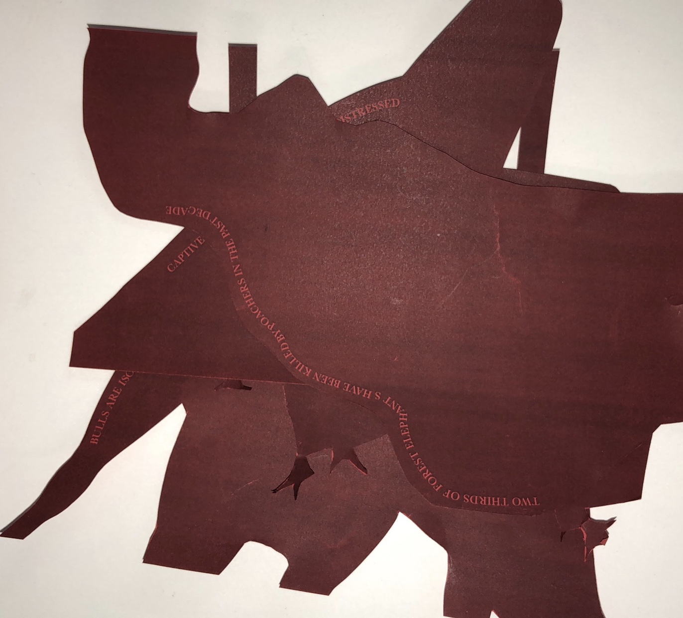


Red coloured back creates a block colour silhouette on better quality paper stock.

No comments:
Post a Comment