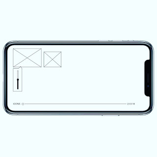
To check the efficiency and usability of the app a prototype was created using Adobe XD. This brought the wireframes to life through animated transitions between each artboard. This effectively created an interactive storyboard, to show how the app's navigation would work on screen through animation. This effectively shows how the user interacts with the extension.
Using XD worked more effectively to demonstrate the storyboard of the app in terms of user interaction. Adobe XD allowed the user to interact with the navigation of the app, whereas with static storyboards this is more difficult to show. In terms of design for screen, Adobe XD was the most appropriate way to present the design.
It was essential to create wireframes of the design for both mobile and desktop so the design can be scaled appropriately to be viewed in a browser and mobile or tablet. The design establishes how not every screen needs a title, navigation can be made simpler through the use of an icon as seen in the design. The content area was also considered it needed to be clear and concise and use the existing Netflix UI to engage familiarity within the user experience.
The functionality of navigation improved with the location of the menu bar being located at the bottom of the screen. This is due to being the easiest location for the user to engage with when operating the extension, in particular on a handheld device such as mobile or tablet. The design is appropriate for the wide audience or persona, inclusive of family, friends, and couples.
The use of a new icon lets the user know that the design is an extension of the existing Netflix application. The design incorporates sophisticated interaction techniques, such as click-and-pull scrolling and multiple selections, to enhance the user’s experience.


