Showing posts with label OUGD504. Show all posts

Monday, 3 December 2018

OUGD504 : Module Evaluation

I enjoyed this module it really helped me gain further knowledge into different approaches to production within the design for print and design for screen brief. It also enabled me to learn and develop new finishing techniques such as foiling and embossing. I do believe this module has enabled me to develop and progress within my own practice there is an improvement in both my design process and practical work. 

The briefs set out were relevant and appropriate to develop my skills and improve my design work. I did reasonably well to balance my workload and manage my time, regularly updating my blog with research and reflection on my work which I aim to maintain. 

I also think I have fulfilled a good learning potential although, I still think my work can progress. But my overall learning throughout this module has helped my progression on the course. This includes the new skills I have learned and the greater focus on production. The feedback I was given was helpful and really helped my work to progress throughout the module. 

The tutors gave me great support during this module. The assessment criteria were clearly explained and explained again closer to submission which was helpful. The Library and Print resources were very helpful due to the resource's equipment and workshops. 

Sunday, 2 December 2018

Design For Screen : Final Crit & Development

Feedback 
  • Does the user have to video chat? - could the user request permission
  • Can the size of the video chat be altered by pinching?
  • Can you show which contacts are online in some way?
  • User profiles page not necessary


Evaluation of Feedback & Development

Feedback received highlighted possible design developments to enhance the user experience further. After incorporating these developments into the design there is a notable improvement to usability of the extension. By refining the navigation to a ROOM icon, back button, film matching and notification icon whilst still having a menu bar at the bottom of the screen. The menu bar keeps an element of similarity to the original Netflix application. The fewer icons as navigation, offers easy usability and little room for the user to not know how to operate the extension.

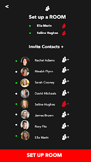
The developments included refining the navigation and enhancing the features. This was achieved by showing online and offline users on the Set-up ROOM page, visualised by a green or white circle icon. The film matching icon changing colour once users in the ROOM have matched a film. The inclusion of a notification icon to show when another user wants to connect with you and a request notification to enable or disable the video chat feature.

Overall these developments did successfully meet the aim of improving both usability and navigation within the extension. Whilst also helping to show a clearer interactive storyboard using Adobe XD, through animated transitions. The design also captures the clean and consistent style of the original Netflix application, using the existing colour scheme and similarly matched typefaces helped to keep the design consistent.

Further improvements could be made to the XD storyboard given there was more time. Instead of just showing one user navigation show a variation of more user experiences. For example, matching more than one movie, or creating a bigger ROOM with more than just two users.

Saturday, 1 December 2018

Design for Screen : Evaluation


Evaluation

Feedback received highlighted possible design developments to enhance the user experience further. After incorporating these developments into the design there is a notable improvement to usability of the extension. By refining the navigation to a ROOM icon, back button, film matching and notification icon whilst still having a menu bar at the bottom of the screen. The menu bar keeps an element of similarity to the original Netflix application. The fewer icons as navigation, offers easy usability and little room for the user to not know how to operate the extension.

The developments included refining the navigation and enhancing the features. This was achieved by showing online and offline users on the Set-up ROOM page, visualised by a green or white circle icon. The film matching icon changing colour once users in the ROOM have matched a film. The inclusion of a notification icon to show when another user wants to connect with you and a request notification to enable or disable the video chat feature.

Overall these developments did successfully meet the aim of improving both usability and navigation within the extension. Whilst also helping to show a clearer interactive storyboard using Adobe XD, through animated transitions. The design also captures the clean and consistent style of the original Netflix application, using the existing colour scheme and similarly matched typefaces helped to keep the design consistent.

Further improvements could be made to the XD storyboard given there was more time. Instead of just showing one user navigation show a variation of more user experiences. For example, matching more than one movie, or creating a bigger ROOM with more than just two users.

Feedback received highlighted the design worked well and had effective usability but offered further development considerations. These have been incorporated into the final outcome. The developments made have improved the extension and provided the best UX by considering the user in greater depth. 

Friday, 30 November 2018

Design for Screen : Final Outcome

To check the efficiency and usability of the app a prototype was created using Adobe XD. This brought the wireframes to life through animated transitions between each artboard.  This effectively created an interactive storyboard, to show how the app's navigation would work on screen through animation. This effectively shows how the user interacts with the extension. 

Using XD worked more effectively to demonstrate the storyboard of the app in terms of user interaction. Adobe XD allowed the user to interact with the navigation of the app, whereas with static storyboards this is more difficult to show. In terms of design for screen, Adobe XD was the most appropriate way to present the design. 

It was essential to create wireframes of the design for both mobile and desktop so the design can be scaled appropriately to be viewed in a browser and mobile or tablet. The design establishes how not every screen needs a title, navigation can be made simpler through the use of an icon as seen in the design. The content area was also considered it needed to be clear and concise and use the existing Netflix UI to engage familiarity within the user experience.

The functionality of navigation improved with the location of the menu bar being located at the bottom of the screen. This is due to being the easiest location for the user to engage with when operating the extension, in particular on a handheld device such as mobile or tablet. The design is appropriate for the wide audience or persona, inclusive of family, friends, and couples. 

The use of a new icon lets the user know that the design is an extension of the existing Netflix application. The design incorporates sophisticated interaction techniques, such as click-and-pull scrolling and multiple selections, to enhance the user’s experience.


Wednesday, 28 November 2018

Development : High Fidelity Wireframe

After recieveing further feedback I initially sketched out further development of the Netflix    ROOM extension. In the format of a low fidelity wireframe, which was later developed digitally. The development included making the extension appropriate for a wider audience. Initially the design focused on couples now the extensions persona is accessible and usable to friends, family and couples. 

The wireframe story board aims to demonstrate how the user would navigate through the enhanced features such as, personalised profiles and film matching, connect with contacts and video call. The tone of voice aims to follow the clean and consistent existing style used by Netflix but still be recognisable as an extension. It was essential the extension did not try to rebrand Netflix.

The wireframe sketches were essential as Netflix can be viewed on a browser or on a larger screen such as a laptop or tablet. This meant it was important the design could be appropriately scaled up from the mobile version. The larger dimensions also affected the layout. Sketches enabled making the design appropriate across a range of screen sizes. After sketching out developments these were then produced digitally, before producing high-fidelity wireframes. 


Tuesday, 27 November 2018

Only Studio : Design for Screen

 A Studio Based in Manchester

Some clients include:
- Goldsmith's University 
- Sony Music
- Lost Village 
- Mercedes 


Things we hear
I'm not very technical 

Design for Screen 

- It's exciting, fast-paced. It is important, a primary means of consuming a brand, experimental and interactive 

- It creates character 

- Using animation and motion to create a better experience for the user 

- Brings brands to life 


Inspiration 
siteinspire.com

Only Studio Design Process

Research 
COMPETITORS
AUDIENCES 
PERSONAS 
PRINCIPLES

Wireframing 
IDEATION 
TEST ASSUMPTIONS 
CLIENT BUY-IN 

Design

Thoughts on digital longevity?
Digital more lasting than print, on average digital design can last 5-10 years. But as brands and technology evolve this will ultimately result in continuous changes throughout a digital product or design's lifespan.  

Is experimentation limited?
Not necessarily but accessibility considerations are important.

How do you find working with a developer?
Working as a small team more effective and being only designers the business models/designs not affected by developers.

How do logistics work by getting clients and maintaining them?
The majority of work comes through referrals and word of mouth after completing a few good jobs to a high standard. 

Friday, 23 November 2018

Design for Screen : The Brief


Design for Screen : Silent Crit


How easy would it be to use?
The user has been considered and it's easy to understand.
Would be easy to use because everyone knows how to use Netflix - looks like it would also work across both mobile and desktop.

Does the layout reflect the idea?
The layout reflects the idea and is easy to use.

What could be improved?
Instead of limiting the design or extension suitable just for couples, make it also appropriate to friends and family. 
Could a notification appear once someone wants to watch something with you.
Don't limit user profiles to couples or types of couples this discounts some. Making the extension also suitable for friends and family would resolve this issue. 

Has the user been considered?
The user has been considered and it's easy to understand.

Do you understand it?
Has been considered and easy to understand.

Feedback 
"Not sure you need a subscription for couples, I think it would be better just as a feature on Netflix where you can connect with people including couples, friends and family."

"The concept is really strong, I like the idea of being able to video chat while watching something and for it to be synchronised so you can watch something with no delay."

"The user has been considered and it's easy to understand."

"Could you have a special pop up or opening screen that advertises this new feature? when you open the app for instance."

"Can you get notifications someone wants to watch something with you."

Developments 
- Instead of a couple subscription just a sharing feature enabling wider usage among both friends and families as well as couples.

- Create a pop up for start up screen advertising the sync feature.

- Show a notification example "user x wants to watch something with user"

- Change him and her to personalised sharing users.