Developing the Idea


Final Outcome Deliverables
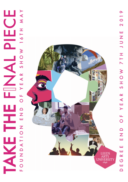
Poster

Advert

Flyer Front & Back


Signage

The final outcome worked well as a campaign across a range of formats. The challenge was refining the design as Natasha kept changing the proposition so this changed the layout entirely so each design became a development. The design shown is the campaign with the latest proposition. However the lack of refinement and constant changing proposition made the design process very difficult.
The design colour scheme is fitting of the University logo which kept the design consistent. The development of the cream background pairs nicely with the pink and creates a more refined image more appealing to the audience. As feedback received commented on white negative space possibly appearing unfinished. White backgrounds are also less appealing to the audience so the cream background created a design solution.
The type was also developed to more effectively visually communicate the proposition. This was achieved through visualising only the stroke of a single character instead of fragmenting the type. This made the type visually more effective due to appearing more dominant. The kerning of the rest of the type was also altered to improve type hierarchy and legibility. Due to some feedback received highlighting legibility as a concern.
Overall the final outcome resolves any design problems that have occurred throughout the process to produce an effective outcome. The design communicates the idea effectively whilst being visually appropriate and of the location and content of the exhibition.
No comments:
Post a Comment