Deliverables
External Signage
A0 Poster
Double sided flyer
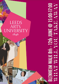
The design was developed to have a more muted colour scheme to draw more focus to one part of the image the logo. Visually this image aims to show experience through the different fragments whilst also representing the proposition of you’ll take something away and give something back.
The serif typeface makes the type legible whilst still being fitting of the fragmented style. The visual for the branding aims to stand out against other advertisements by creating a sense of intrigue. This was achieved through layout and extreme cropping of the image hoping to provoke curiosity amongst an audience to see the full picture by attending the exhibition.
Feedback received highlighted the typeface used was more considered than the more simplistic initial typography ideas. Although Ava & Natasha expressed concerns around legibility although feedback from other Graphics students agreed with this being the most appropriate typeface. The typeface works well to visualise the idea’s proposition the idea that Leeds Art’s University allows you to ‘take something away and give something’
The image was further developed by using a more muted colour scheme and combining the image with the University logo this combined well with the geometric fragmented image visually harmonising the image and the logo, rather than being a separate elements. The coloured background brought more of a visual focus to the image but due to the image being colourful as a group it was decided a white background is best in contrast to the colourful image.


No comments:
Post a Comment