Thursday, 14 February 2019

OUGD503 End of Module Evaluation

This module has enabled me to build a body of work some suitable for my portfolio whilst teaching valuable skills of working with a client, reflecting how working for a client effects the design process. This module also enabled me to develop finishing method skills acquired in the first module this year. 

The briefs set out were relevant and appropriate to develop my skills and build my design portfolio. I did reasonably well to balance my workload and manage my time, regularly updating my blog with research and reflection on my work which I aim to maintain. 

I also think I have fulfilled a good learning potential although, I still think my work can progress. But my overall learning throughout this module has helped my progression on the course. This includes the new skills I have learned and the greater focus on working collaboratively and with a client. The feedback I was given was helpful and really helped my work to progress throughout the module. 

However as mentioned previously collaboration would have been more effective if the teams were made up equally, two on two or one to one. This would be a much more effective collaborative team so all members points are adhered to with less of biased views over running the design process. 

The tutors gave me great support during this module. The assessment criteria were clearly explained and explained again closer to submission which was helpful. The Library and Print resources were very helpful due to the resource's equipment and workshops. 

Creative Advertising SB2: Final refinements

Feedback from Creative Advertising students was to upgrade the proposition to 'what will you take away' They liked the development of type and agreed it visualised the proposition and idea well. Unfortunately they were very slow and did not really deliver any of the content which should of been created until the very last minute. 

The proposition colour was also made slightly darker to create a point of difference and contrast to the other type. The brief also mentioned how the University ranks No.1 Design & Crafts in the Guardian league table so it was discussed as a group and was decided this was important information to include. 

Overall this collaboration was extremely difficult, in evaluation I should have been much stricter with regards to time management in order to get what I needed for content much sooner. The type and proposition included should also have been decided much sooner for development to have been more effective. 


Poster


Advert


Flyer Front


Flyer Back


Signage

Monday, 11 February 2019

Managing Time


To Do List 

Monday
  • Final Outcome Design Board
  • Evaluation Design Board 
  • Take pictures of fashion business cards
  • Simran collab contract
  • Feedback blog post 
  • Submission board for penguin & absolut
  • Print all briefs 
  • Print module submission label 
  • Print other contract for EOYS Collab

Tuesday
  • End of module evaluation 
  • Print Design Boards

Submission Boards


I created submission boards for the two competition briefs completed within the responsive module. Both briefs were reasonably short. The briefs themselves only require a digital submission. Penguin required a full page spread and just cover saved as a pdf. Whereas Absolut only required a 300dpi image submission. These submission boards helped present the designs for these briefs in a professional format. 

Responsive Feedback


Feedback:

"Would taking away a full character be effective in visualising the proposition"  

"Could a dashed line represent 'missing' better"

"Could off-white make the background more appealing and refined"

"Type works well, clearly communicates the idea"

"Idea is visualised well through type and image"

"The missing character may not be legible to people less aware of art and design communication"

"We love the way the typography also visualises the proposition"


The developments actually worked well and all of the group were happy with the outcome. The proposition will be tweaked slightly for final developments before presenting our idea. The developments helped to achieve a visual style effectively visualising and communicating the idea in favour of all members of the group. 

Creative Advertising SB2 : Evaluation


This brief was extremely difficult mainly refining the idea into a design as Natasha kept changing the proposition which changed each layout entirely. It was also difficult being the only Graphic Designer with two other Creative Advertising students. The collaboration would of perhaps been more successful one to one. Due to this creating more of a collaborative work environment rather than one or two person’s ideas being dominant throughout the process. 

The final image clearly communicates the message although feedback from other Graphic students agreed some initial design developments visually were much stronger images and still communicated the idea. However, due to this being a collaborative project it was important to go with the majority vote within the group. 

The developed type and colour scheme worked better than initial type designs resolving design problems encountered throughout the process. These developments created higher quality visuals, dominant typography with a level of hierarchy. The developments produced a high quality outcome that  visually and typographically communicates the idea. 

As mentioned previously the brief offered lots of potential exploration and with improvements to the group size being made smaller the collaborative work balance would be much more suitable. The better work balance would also make the design process run smoother hence this produce more effective outcomes. Collaborative work is much better one to one and this was demonstrated in the other collaborative brief. 

Creative Advertising SB2 : Sixth Meeting : Final Outcome

Developing the Idea


Final Outcome Deliverables

Poster


Advert


Flyer Front & Back


Signage


The final outcome worked well as a campaign across a range of formats. The challenge was refining the design as Natasha kept changing the proposition so this changed the layout entirely so each design became a development. The design shown is the campaign with the latest proposition. However the lack of refinement and constant changing proposition made the design process very difficult. 

The design colour scheme is fitting of the University logo which kept the design consistent. The development of the cream background pairs nicely with the pink and creates a more refined image more appealing to the audience. As feedback received commented on white negative space possibly appearing unfinished. White backgrounds are also less appealing to the audience so the cream background created a design solution. 

The type was also developed to more effectively visually communicate the proposition. This was achieved through visualising only the stroke of a single character instead of fragmenting the type. This made the type visually more effective due to appearing more dominant. The kerning of the rest of the type was also altered to improve type hierarchy and legibility. Due to some feedback received highlighting legibility as a concern. 

Overall the final outcome resolves any design problems that have occurred throughout the process to produce an effective outcome. The design communicates the idea effectively whilst being visually appropriate and of the location and content of the exhibition. 

Friday, 8 February 2019

Creative Advertising SB2 : Fifth Meeting : Further Development

Publication Advert


Flyer Front


Flyer Front


Poster


The design process was difficult as Natasha and Ava were pretty set on their own ideas for the design so this made it difficult for the knowledge I have to be adhered to. This was one downfall of the final outcome the type was stronger in the design development stage as opposed to the final outcome. As identified by feedback but due to it being a collaborative project it was important to implement the other group members requirements into the final design. 

The final outcomes visualise a design solution to combine all of the groups ideas avoiding the design not just over-ruled and designed by individual opinions. The colour scheme draws focus to the branding and location of the exhibition. This was a problem identified during research resolved through the consistent colour scheme of pink typography creating an effective design solution.  

The developed type has improved legibility and consistency for Natasha and Ava who initially expressed concerns. The type still visualises the proposition well but in a more even visual consistency.  

The curiosity element encouraged by the design’s image works well to meet the requirements of the brief of standing out against existing and competing advertisements. Engaging with an audience through feelings or the sense of curiosity is a great way to create interest and intrigue around and event. Feelings like this will encourage people to attend Leeds Arts University End of Year Show over competitors due to the engaging design and audience response. 

Creative Advertising SB2 : Fourth Meeting : Design Development

DESIGN DEVELOPMENT 


Deliverables 

External Signage


A0 Poster 


Double sided flyer


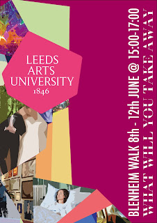
The design was developed to have a more muted colour scheme to draw more focus to one part of the image the logo. Visually this image aims to show experience through the different fragments whilst also representing the proposition of you’ll take something away and give something back.

The serif typeface makes the type legible whilst still being fitting of the fragmented style. The visual for the branding aims to stand out against other advertisements by creating a sense of intrigue. This was achieved through layout and extreme cropping of the image hoping to provoke curiosity amongst an audience to see the full picture by attending the exhibition. 

Feedback received highlighted the typeface used was more considered than the more simplistic initial typography ideas. Although Ava & Natasha expressed concerns around legibility although feedback from other Graphics students agreed with this being the most appropriate typeface. The typeface works well to  visualise the idea’s proposition the idea that Leeds Art’s University allows you to ‘take something away and give something’ 

The image was further developed by using a more muted colour scheme and combining the image with the University logo this combined well with the geometric fragmented image  visually harmonising the image and the logo, rather than being a separate elements. The coloured background brought more of a visual focus to the image but due to the image being colourful as a group it was decided a white background is best in contrast to the colourful image. 

Tuesday, 5 February 2019

Creative Advertising SB2 : Third Meeting : Initial Ideas

The Idea 
What will you discover - you won't believe it till you see it. 

References 

Magic eye images 
Optical illusions 

Further Research 

How to visualise an experience?


- Interact 
- Engage with it 
- Lights 
- Peoples emotions   
- 5 senses 
- Element of surprise


Initial Visual Ideas

After researching further into references and exhibitions providing an experience. I was able to generate visual layouts and type inspired and relating to the exhibitions hexagonal logo. The visuals aim to visualise an experience through interpreting a light beam due to most exhibitions using light to visualise the experience element of the exhibition. Whilst the connection to the hexagonal logo brands the exhibition as Leeds Arts Uni exhibit. 

Poster layout/format


Digital mock up 


Type created and design using LAU hexagonal logo

Time Management : Responsive


Saturday, 2 February 2019

Collaborative SB2 : Logo & Business Card : Research


Research looked into existing branding for fashion designers and photographers. This research also identified the professional finishing method as foiling. Although gold is commonly used silver foil would pair nicely with the clients black and white photography. This meant making a design suitable and appropriate for the finishing method of foiling to be applied. 

These examples use a script typeface sometimes paired with a sans serif type. This formed inspiration for the clients design. This created the idea of a script stylised logo of the clients initials paired with a sans serif type such as Helvetica light for the clients full name.

The script stylised logo will be created by brushstrokes in illustrator. The characters of her initials are very stylised like fashion illustrations are. The initials are inspired and interpreted from research into calligraphy. 

Further research into calligraphy inspired the style and visual for the logo. This aesthetic will make the logo unique but still fitting of the professional aesthetic the client requested. The brush stroke most appropriate for this style is a varied stroke width fitting of the calligraphy aesthetic. A varied width also adds more depth to a design and appears much less flat. The logo and type will be foiled to produce a high quality finish on a smooth matt stock this will be most effective. Adding a finishing method such as foiling increases the designs outcome whilst effectively meeting the requirements set out by the brief.