Monday 26 February 2018

Challenging the basic concepts of a Publication

After considering what my publication would contain I thought the next important stage was to think of ways I could challenge the basic concept and curation of my publication. Basic concepts you expect from a publication are organisation aesthetically pleasing and engaging. Therefore I came up with alternative ways to show and challenge these basic concepts of a publication. 

A rough generation of these examples can be shown below on varied colour paper stock. I experimented with collage, tearing, inserts, folding and creasing manipulation techniques. I thought the coloured paper was more engaging but also worked well in contrast to the black and white imagery. These techniques were successful in my opinion and not only more engaging but also made the publication more intriguing and can be described as aesthetically pleasing because of this factor and challenging attribute. 


Sunday 25 February 2018

Initial Ideas & Brainstorming : Penguin Books Competition

Initially I created a brainstorm to broadly approach the theme of my selected book, A Brief History of Time. Enabling me to identify key terms, subject matters, objects and quotes that could be incorporated into the design. This avoided any limitations in my ideas and research. I also initially wanted to generate my own imagery in the form of illustrations. This helped create a more personal style and approach to any initial thoughts and ideas. Creating my own imagery also meant more cliche objects associated with the title could be used as handmade illustrations made the objects more interesting. 


Initial Ideas Illustrations :


Layout Initial Ideas : 

The black and white symbolises a contextual link to history and monochrome was historically how visuals were presented before the introduction to colour. The vintage clock hand also visually represents time and history combined in an illustration. The physics equations reference Stephen Hawking himself as a Physicist. Whilst the visual poetry inspired layout of the blurb in the shape of a sand timer also references time.  


Dark blue also references the universe by being a generic colour associated with the sky the dark shade references the depth and vastness of the universe. The patterned illustration created in illustration uses patterned brush strokes to visualise the blackhole.


For this design I used black to visualise the universe and the other colours to symbolise the physics of how white light travels through a glass prism and the light dispersion into colours indigo, violet, blue, green, yellow, orange and red. 


Friday 23 February 2018

Cell Phone Symphony : Refinements Critique

Generally feedback I received was positive and explained the idea as visually successful, however also gave me some considerations and aspects of the design I could modify and develop. This included the type of Cell Phone Symphony and Bring Your Phone displayed all in capitals to create an even higher impact. This also creates a more visually consistent style and concept approach to typography. After reflecting on these refinements I agree it created higher impact and even strengthened the type as the design is now even more visually consistent. 

Overall the feedback enabled me to improve the design by further refinements and modifications. Although I still need to experiment with different paper stock to find what is most suited to the design. Although a glossy paper stock was suggested through feedback and I have considered this myself as this may be quite fitting to the contextual link between the design and the Yell Yellow Pages Phone Book.

Before:


After:


Publication 2 : 26 Objects

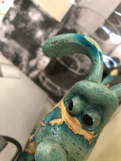
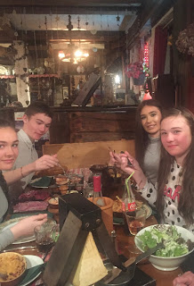
The starting point and initial brainstorming stage came originally from creating a stream of consciousness for each of the five objects. The objects I chose include the following, a Gromit ornament displaying a map, cards, lip-balm, a map and photographs. This helped me have a broader and less limiting initial approach to the brief. Below shows notes based on the stream of consciousness exercise. 

The next stage of initial thoughts involved establishing a link from the words generated by each objects stream of consciousness. I was then able to establish a link either by similar or repeating words generated through this process. The words that link can include, lost, Geography, surroundings, directions and family. This led on to be able to consider how this link relates to concepts such as location, alphabet, time, category and hierarchy. 

The next stage discussed expectations of a publication and specifically a photograph. Next I considered how these expectations could be challenged, reversed or manipulated. Initially I considered altering the orientation of photographs as they usually have a uniform orientation either portrait or landscape. This could be challenged either by a diagonal orientation or playful manipulated orientation to represent the disfigurement and confusion feeling you have when being lost. 


Other Ideas: 1-26 

1. View finder shaped photos - the photos cut into shapes of countries to illustrate map illustrating directions an item you may need if lost. 

2. Photo cut to shape e.g. skis

3. Photo cropped - bits missing symbolise when you are lost you don't know your location

4. Draw objects scattered and joined by dotted line often seen to illustrate a map

5. Photograph each object on a higher/lower step - to represent the different parts of your surrounding separated because you don't know your surroundings if you are lost.  

6. Photograph objects in a homely and outside environment - this compares the feeling of home and an unfamiliar environment

7. Fold photograph into the shape of slope or mountain - the place I got lost 

8.  Tear bits to hide elements of photograph 

9. Create marks hiding elements of the photograph

10. Use collage to hide elements of photograph 

11. Storyboard 1 object first adding another object each photograph until all five objects are in one photograph

12. Digitally remove elements of a photo using Photoshop

13. Blur part of a photo

14. Page folded like a map

15. Photograph objects in light and dark conditions

16. Square collage grid of photographed objects with a few squares blanked out 

17. One page crumpled up 

18. Map symbols overlaying image 

19. 3D map symbols created using card stuck on top of photograph

20. Drawing the objects spread out on tracing paper.

21. Folded colour A4 page insert cut into the shape of mountain overlaying photograph

22. 'X' marks the spot tracing paper overlay

23. Use collage to reconstruct the entire photograph.

24.  Postcard layout insert made from photograph of objects 

25. Hands or hand covering photograph 

26. Objects placed outside the background being a bus stop


Using Photography to experiment with composition challenging orientation:


Original Photos: