Friday 28 December 2018

SB1 : Penguin Children's Cover Award : Design Development


Final Development


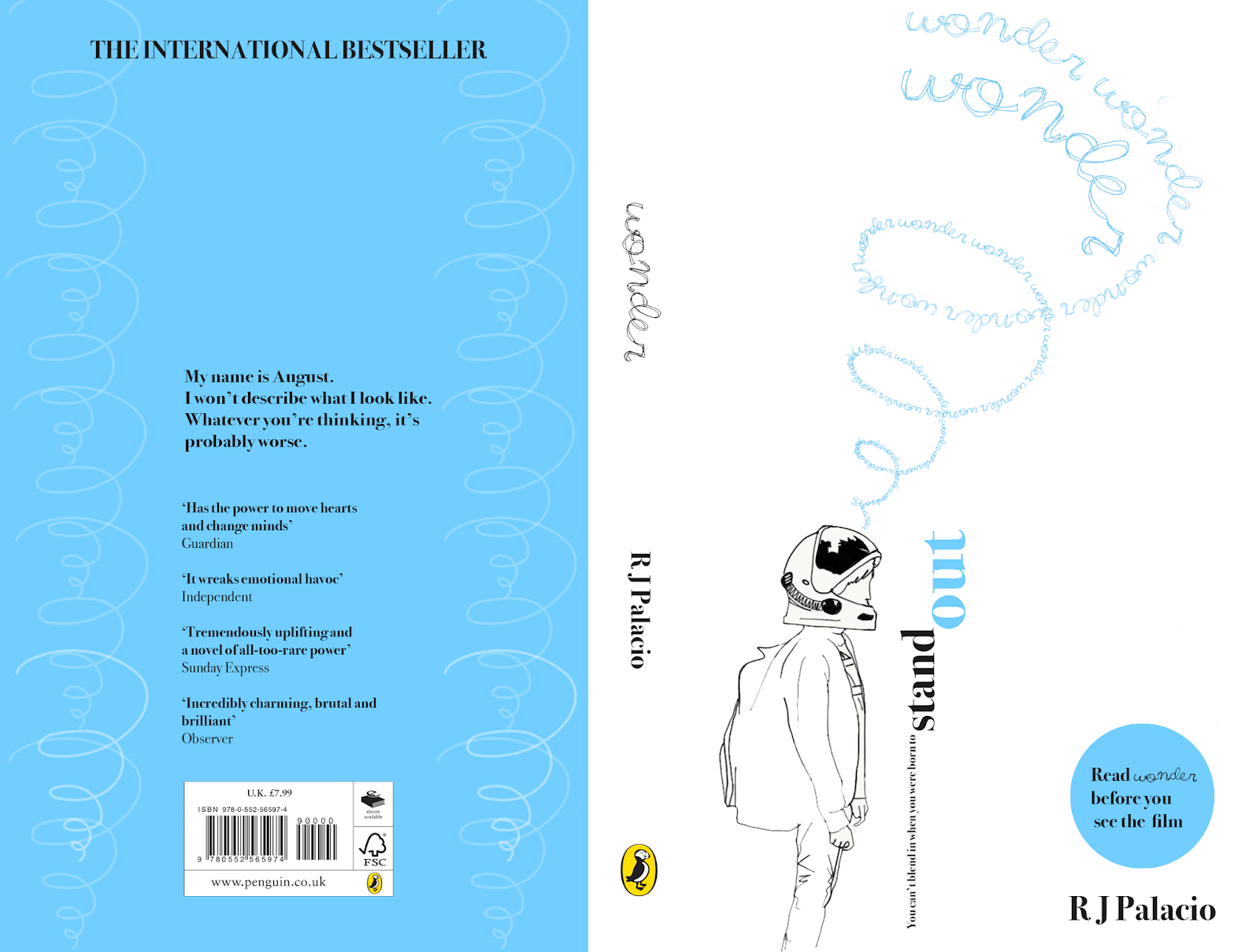
The design was further developed by altering the shape and by making the shape a type path instead of a line. This created an interesting typographic structure. This structure aimed to visualise the different emotions and feeling of 'wonder'. The structure worked well but due to the scale of the type it was more challenged legibly, to resolve this slight alterations and variations where made to the shape itself initially. 

Afterwards, the scale was altered going from large to smaller type aiming to make the title appear more dominantly. This scale from big to small was most legible but the inclusion of the title enlarged further following the same shaped path made the title 'Wonder' dominant and more legible. This offered a solution to both problems with previous designs, surrounding legibility and the scale, was it appropriate to be identified as the title. 

The final development design worked well and resolved all the problems encountered throughout the design process. 

SB1 : Penguin Children's Cover Award : Initial Ideas


Have an imaginative concept
The design uses illustration, shape and placement of type to create an imaginative concept. 

Be an original interpretation of the brief
The design is original with the typeface aiming to target a younger audience of which the main character Auggie is based upon and it contains an original illustration to visualise Auggie.

Be competently executed with strong use of typography
The typography is executed strongly through its placement and relation to its audience the script type relates well to visualise the target aged reader and age of the main character Auggie. 

Appeal to the broadest possible audience for the book
The design aims to be relatable to a younger audience but the use of negative space and cleverly placed type makes the design also appealing to a much wider audience. 

Show a good understanding of the marketplace
The design relates to a wide audience and the story and feelings the book aims to evoke.

Have a point of difference from other books that it will be competing
against in the market
The book uses shape to create interesting type formats for example the strap-line uses larger type to make the stand out quite literally stand out on a vertical placement that matches the illustration of the main characters height. 

Be able to sit on the shelves of a supermarket or ebook store as easily as it sits on those of more traditional bookshops 
The design is suitable for a broad range of format including traditional and ebooks. The high contrast colour scheme and use of negative space does also increase legibility and allow more for a script title aiming to visualise emotions, the main character and relate to the audience of the book. 

Thursday 27 December 2018

SB1 : Penguin Children's Cover Award : Research

Existing covers:


Definition:


Word associations from the book and word 'wonder':

- Space 
- Unique 
- Universe 
- Feeling
- Admiration 
- Amazement 
- Friendship
- Tenacity
- Fear
- Kindness

Design should aim to incorporate:
- Friendship
- Tenacity
- Fear
- Kindness


Blurb
'My name is August. I won't describe what I look like. Whatever you're thinking, it's probably worse.'

Auggie wants to be an ordinary ten-year-old. He does ordinary things - eating ice cream, playing on his Xbox. He feels ordinary - inside. But ordinary kids don't make other ordinary kids run away screaming in playgrounds. Ordinary kids aren't stared at wherever they go.
Born with a terrible facial abnormality, Auggie has been home-schooled by his parents his whole life. Now, for the first time, he's being sent to a real school - and he's dreading it. All he wants is to be accepted - but can he convince his new classmates that he's just like them, underneath it all?

WONDER is a funny, frank, astonishingly moving debut to read in one sitting, pass on to others, and remember long after the final page.


The winning design will need to:
  • have an imaginative concept
  • be an original interpretation of the brief
  • be competently executed with strong use of typography
  • appeal to the broadest possible audience for the book
  • show a good understanding of the marketplace
  • have a point of difference from other books that it will be competing
    against in the market
  • be able to sit on the shelves of a supermarket or ebook store as easily as it sits on those of more traditional bookshops 

SB1 Final Outcome & Evaluation : Bangor Optometrists


The final design worked well once produced and was very fitting to the bay window format. The logo design of the eye or ‘O’ of Optometrists directly in the centre instantly catches the eye of passers by whilst also identifying the practice is an opticians. This meant the design stood out against surrounding competitors as it is difficult to know at a glance without reading the full sign that other practices are Optometrists. 

The black background in contrast to the white type not only made the sign more legible meeting client needs but also stands out against all the existing shops on the street due to the high constrast design and almost entirely monochrome colour scheme. Overall the client was very happy with the finished design and it has already been admired by surrounding shops, like the bridal shop next door!

Further refinements to the production were made by experimenting with possible business card formats and production techniques as seen below.  This is an ongoing process but initial ideas can be seen. Below experimenting with different stock and silver foil using the foiling method overlaying the type. 


Final Outcome Business Card


Final Outcome Letterhead


Final Outcome Compliment Slip


Final Outcome Mailer return patients 


SB1 Design Development : Bangor Optometrists

At this stage design development became easier because the client identified an existing branding style they liked and wanted the design to incorporate. 

The initial ideas show experiments with different kerning and script versus sans serif and serif typefaces. For the script type I was able to experiment with my own script typeface design and an existing script type. Some of the initial ideas even combine my own typeface with an existing typeface. Initially the client liked the script and sans serif type combination although there were some concerns around the bay window element and if the script type on a bay window would challenge legibility perhaps too much. 

Due to the clients most important needs being legibility a serif typeface was a great way to enhance each characters legibility as each letter form is easily identifiable and lacks the confusion there may be with sans serif typefaces e.g. ‘l’ being confused with ‘i’. The typeface selected for the design after development was ‘Didot’ the varied stroke or weighting in each character created a clear aesthetic. The serif typeface met the legibility requirements of the brief and client. 


SB1 Initial Research : Bangor Optometrists

Inspiration 
Howard Street 


Existing practices 

- Vision Express
- Specsavers
- Mackey Optician's 
- Howard Street 
- Orla Ramsden Opticians 


Client wants/needs

- Script handwritten type
- Liked existing branding of Howard street and client wanted to incorporate a similar style into the design in some way.
- Legible
- Suitable for bay window 
- Include the numbered address (110 HSt)


Initial ideas 
Initial. Ideas experiment with layout, kerning and typefaces. However, initially the client was still undecided on the name hence some of the mock ups having different names. ‘Bangor Optometrists’ was finally decided as the name. Once this was decided it was possible to further refine and develop some of the initial ideas. 


Monday 3 December 2018

OUGD504 : Module Evaluation

I enjoyed this module it really helped me gain further knowledge into different approaches to production within the design for print and design for screen brief. It also enabled me to learn and develop new finishing techniques such as foiling and embossing. I do believe this module has enabled me to develop and progress within my own practice there is an improvement in both my design process and practical work. 

The briefs set out were relevant and appropriate to develop my skills and improve my design work. I did reasonably well to balance my workload and manage my time, regularly updating my blog with research and reflection on my work which I aim to maintain. 

I also think I have fulfilled a good learning potential although, I still think my work can progress. But my overall learning throughout this module has helped my progression on the course. This includes the new skills I have learned and the greater focus on production. The feedback I was given was helpful and really helped my work to progress throughout the module. 

The tutors gave me great support during this module. The assessment criteria were clearly explained and explained again closer to submission which was helpful. The Library and Print resources were very helpful due to the resource's equipment and workshops. 

Sunday 2 December 2018

Design For Screen : Final Crit & Development

Feedback 
  • Does the user have to video chat? - could the user request permission
  • Can the size of the video chat be altered by pinching?
  • Can you show which contacts are online in some way?
  • User profiles page not necessary


Evaluation of Feedback & Development

Feedback received highlighted possible design developments to enhance the user experience further. After incorporating these developments into the design there is a notable improvement to usability of the extension. By refining the navigation to a ROOM icon, back button, film matching and notification icon whilst still having a menu bar at the bottom of the screen. The menu bar keeps an element of similarity to the original Netflix application. The fewer icons as navigation, offers easy usability and little room for the user to not know how to operate the extension.

The developments included refining the navigation and enhancing the features. This was achieved by showing online and offline users on the Set-up ROOM page, visualised by a green or white circle icon. The film matching icon changing colour once users in the ROOM have matched a film. The inclusion of a notification icon to show when another user wants to connect with you and a request notification to enable or disable the video chat feature.

Overall these developments did successfully meet the aim of improving both usability and navigation within the extension. Whilst also helping to show a clearer interactive storyboard using Adobe XD, through animated transitions. The design also captures the clean and consistent style of the original Netflix application, using the existing colour scheme and similarly matched typefaces helped to keep the design consistent.

Further improvements could be made to the XD storyboard given there was more time. Instead of just showing one user navigation show a variation of more user experiences. For example, matching more than one movie, or creating a bigger ROOM with more than just two users.