Thursday 30 November 2017

Johannes Itten : The Elements of Colour

About 


Johannes Itten ( 11th November 1888 - 25th March 1967)

Itten is well known in the art and design world. He was an expressionist painter, designer, teacher and even theorist. The fact we are currently learning about his theories on colour proves his relevance in the world of design. He was an essential part of the Weimar Bauhaus. His main work was teaching students the basics of material characteristics, colour and composition. 

Influence 


Itten has strongly influenced how artist's and designers work in practice today. His most influential studies of colour palettes and interaction influenced many significant art movements. Projects by Itten such as 'Colour Me A Season' gained popularity after his death and can be seen in many concepts today, specifically the cosmetic industry. 


7 Colour Contrast 


Itten was one of the first people to identify strategies for successful colour combinations. He came up with seven methodologies for co-ordinating colours utilising hues contrasting properties. These include the following:

- Contrast of Hue 
- Contrast of Light and Dark 
- Contrast of Cool-Warm 
- Contrast of Complements
- Simultaneous Contrast
- Contrast of Saturation
- Contrast of Extension


Wednesday 29 November 2017

History of Colour

Colour Wheels, Charts and Tables through History 


This research shows the last four centuries visual organisation and sense of colour. Different forms and methods are used such as simple wheels to more complex colour pyramids also forming a basis on human emotion. 


Richard Waller’s “Tabula Colorum Physiologica”, from “A Catalogue of Simple and Mixt Colours with a Specimen of Each Colour Prefixt Its Properties,” in Philosophical Transactions of the Royal Society of London, vol. 6 for the years 1686 and 1687 (1688).


Illustrations from the 1708 edition of Traité de la peinture en mignature, an artist’s manual attributed to “C.B.” (most likely Claude Boutet) 


A chart from 1746 by Jaques-Fabien Gautier illustrating his theory that the primary colours are black and white, with red, yellow, and blue being secondary. Colours were thought to be drawn out of the shadows by the presence of light. 


A shaded colour wheel from the pen of British entomologist Moses Harris, featured in his The Natural System of Colours (1766) 


Image from Jacob Christian Schäffer’s Entwurf einer allgemeinen Farbenverein (1769) illustrating the idea of colour as genealogical and hierarchical: the principal colors are not presented as a continuous line but as families, each with its own coat of arms.


Colour wheel by the Austrian entomologist Ignaz Schiffermüller, featured in his treatise on colour Versuch eines Farbensystems (1772)


Georg Christoph Lichtenberg’s representation of the three-sided colour graph developed by the astronomer and mapmaker Tobias Mayer. 


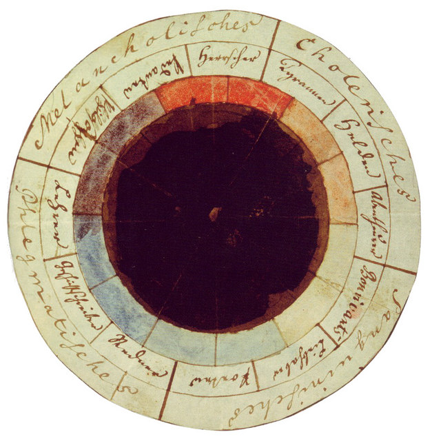
The “rose of temperaments”, a study from 1798/9 by Goethe and Schiller, matching twelve colours to human occupations and character traits, grouped in the four temperaments.


Goethe’s famous colour wheel, created in 1809, was used to illustrate the chapter “Allegorical, symbolic, and mystical use of colour” in his seminal work Farbenlehre (1810) 


Two plates from James Sowerby’s A New Elucidation of Colours, Original, Prismatic, and Material (1809) 


Philipp Otto Runge’s Farbenkugel (1810). The top two images show the surface of the sphere, while the bottom two show horizontal and vertical cross sections.


A chart showing “simultaneous contrasts” from A Class-Book of Colour: including colour definitions, colour scaling, and the harmony of colours (1895) by Mark Maycock.


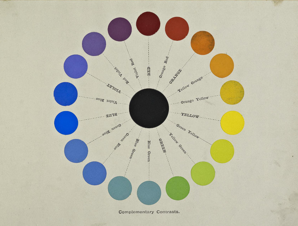
Circular chart showing “complementary contrasts” from A Class-Book of Colour: including colour definitions, colour scaling, and the harmony of colours (1895) by Mark Maycock.


Frontispiece to Annie Besant and Charles Leadbetter’s 'Thought Forms' (1905), matching colours to particular emotions.


Illustration from The Principles of Advertising Arrangement (1912) by
Frank Alvah Parsons.


Three plates from Robert Ridgeway’s Colour Standards and Colour Nomenclature (1912)


Pantone : Emerald

"PANTONE 17-5641 Emerald, a lively, radiant, lush green, is the Colour of the Year for 2013." (https://www.pantone.com/color-of-the-year-2013)


Emerald Mood Boards 


Emerald is most often associated with the precious gemstones. This also proves the perception of the emerald to be luxurious and sophisticated. The represents beauty and new life both culturally as well as being recognised in religion. It can also be recognised as the colour for growth and prosperity. Historically for centuries green has been recognised as the colour for unity and healing. 

Green is the most abundant hue in nature – the human eye sees more green than any other colour in the spectrum,” - Leatrice Eiseman


In symbolic terms emerald brings a sense of clarity and renewal which is important even in modern day even though we see the use of emerald throughout history is is still classed as relevant with visual meaning. This colour is powerful and universal for many contexts. Emerald is also harmonious on the colour wheel also and can be used to intensify and complement other colours. 

Emeralds have hues ranging from yellow to green to blue-green but the primary hue is green. The yellow and blue hues are known as secondary. A fine emerald will be highly saturated and have a hue that is bright or vivid. The modifier normal saturation in emeralds and is usually the colour grey. 


Emerald in Culture


Emerald is regarded as the typical birthstone associated for May and the traditional gemstone for the astrological sign 'Cancer.' Another example involves the chief deity one of India's most famous temple. the Meenakshi Amman Temple in Madurai, a goddess, whose idol is traditionally thought to be made of emerald.


Monday 27 November 2017

Chroma Design Architecture & Art in Colour


(Book : Chroma Design Architecture & Art in Colour: Barbara Glasner, Petra Schmidt: 27/11/17)


Colour and Design

Seeing Colour 


(Book : Colour and Design : Marilyn De Long and Barbara Martinson : 27/11/17)

Human perception is not a process where one thing follows another in a logical order such as A to Z. It involves searching with a range of perceptions cognitive strategies and approaches. Human perception is more of an interaction to surroundings. This involves considering how we feel and what we recognise etc.

Perception of colour is a prerequisite of seeing and essential for survival. 

"Colour is what we see; to see colour is to see. What things of a given colour have in common is the way they look. If everything in the surrounding world - even shadows - had the same hue and nuance, we would not be able to discriminate one thing from another." 

Without colour there would be no visual relations and no significant visual form. Without any colour at all a visual world would not be conceivable. Visually we use colour as a way of perceiving form. Colour contrast also helps us to distinguish borders and edges and can also be used to form an impression. 

Categorial Perception : aims to structure our perceptions

"To be able to make conscious colour choices, the designer has to find or create expressive symbols, patterns of perceived qualities, that are likely to cause special emotional reactions and feelings in the person perceiving the object or colour. The principles can be learned and analysed. Based on everyday experience of life, and contrary to what is often stated, 'taste' only plays a minor part in the judgement of what we see - and not even personal taste is so unique as we might want to believe."


Indirect Experience & Meaning 

A colour or colour combination may be symbolic or dependent upon agreement, some examples include traffic signals, social colour codes and fashion . colours etc. In the 19th century in the Swedish class society it was common that lower class people were not allowed to wear strongly chromatic clothing; it was an upperclass privilege. Interpretation can also be based on analogy for example love being associated with the colour red. Colour can also be connected with words making them dependant on context. 

Colour Relationships 

Relationships between colours is of high importance specifically to the designer. Historical perspectives of colour include different views both theoretically and personally. A critical knowledge and key colour sense is the basis of any design process. How successful a colour harmonises is purely based on personal perception.


Mutual Influences among colour 

The chemist Michel Eugene Chevreul (1786-1889) Chevreul demonstrated through a series of experiments, that by simultaneously observing juxtaposed coloured surfaces, two types of alterations are noticeable in appearance. The first concerns the intensity of colour or lightness known as the contrast of tone. Secondly applies to the colour itself or the contrast of colour. This happens when a colour yields to the one close to its complementary, so the law of simultaneous contrast is the reason when complementary colours are matched they appear brighter. 


Colour Contrast

Among other investigators the work of Johannes Itten (1888-1967) is well known. His work is founded on the concept of harmony as balance - symmetry of forces - and on the opposition of colours fading away in the grey, which he synthesized in the seven chromatic contrasts of his colour theory.

The Design Context

Colour is a fundamental design component. When a colour combination is applied it is not until it is applied in context that we value colour's effectiveness. The work of Shigenobu Kobayashi, organises colour combinations into categories motivated by different moods they refer to. However as cultural contexts change , so do notions of order and harmony. 


Colour : Organisational Strategies 

If colour is organised to function as a visual language the message will be clear. Colour combinations can be made to fit a variety of contexts for example, in a visual order of importance or sequence etc. This depends on controlling the visual relationships of the three attributes of colour; hue, value and chroma contrast. Controlling these will effect our perception of importance and dominance within a colour combination. 

Important of research in design work 

Effective colour assembly strategies produce strong visual impact, improve legibility and define product identity. Meaningful use of colour should also improve the efficiency of a message. Colour must serve as a primary structural element in print, digital and product design, whilst also creating appropriate spatial and navigational effects. It is also a known fact colour plays an influential role in the interpretation of a message. 


Colour Structures Research Study 

Perception is the process of us acquiring information about our surroundings using our five senses. Colour can also be defined as the system of representation relating to our cultural and psychological experiences rather than just a personal perception.

- Colour is subjective as it can be associated with our psychology.
- Colour is objective as it has inherit hue, value and chroma characteristics.


Research Methodology : Colour Structures

Hue is the generic name of colour and is a term used for colours contained within the visible spectrums. Value of colour can be defined as the relative lightness and darkness represented in a white to black scale. Colours that are modified by black and white can be defined as shades and tints. The chroma attribute can be defined by a colour saturation point. Fully saturated colours modified by grey can be referred to as tones. 


Stimuli - Value, Chroma & Hue Saturation 

Conventional colour harmonies form the foundation of colour organisation, however cannot be sufficient unless colour contrast relationships of the colours attributes are also considered.

Colour in Context, Culture & Traditions 

Specific colours have a variety of meanings and may be recognised as an aspect of location. It can also be used to portray a signal such as protection and firefighters uniform. Historical context can also be a strong influence on colour and colour combinations.


Colour and Cultural Meaning 


Most colours have different meanings and aesthetic appeal and can be considered and used differently in a variety of cultures.


A Dictionary of Colour

COLOUR KEY TERMS 


(Book : A Dictionary of Colour : Ian Paterson : 27/11/17)

A - Allochromatic : a change of colour ; as regards minerals, having no colour
- Base colour : a colour which is predominant in a colour scheme 
- Chroma : the extent of a colour's brightness or saturation ; the purity of colour 
- Daltonism : colour blindness ; the inability to distinguish red from green 
- Eidetic : vivid
- Ferrugin : rusty
- Gaudy : brightly coloured to the point of vulgarity 
- Hue : the purest and brightest form of a colour having no white or black mixed in it 
- Infuscation : the process of making something dark
- Jade : a green in various shades, but mainly yellowish green
- Kaleidoscope : a changing pattern of colours
- Lambent : as regards light, radiant or bright 
- Melanophore : a colour changing cell or chromatophore which contains black pigmentation 
- Neon : bright and garish colour 
- Obfuscous : dusky or dark 
- Pale : dim, lacking brightness ; as regards colours, whitish, lacking intensity 
- Quiet  : as regards colour, moderate, low key 
- Risque : off-colour
- Sad : dull,dark
- Tertiary : mixing a primary with a secondary colour
- Undertone : particular bias of a colour
- Vivid : very bright, lively or brilliant in colour; intense
- Warm colours : orange, red and yellow
- Xanthocyanopsia : colour blindness as regards yellow and blue
- Yellow : one of the three subtractive primary colours
- Zircon : green 'Parisian art shade' 

Colour in Context

Colour Making and Using Dyes and Pigments 


(Book : Colour Making and Using Dyes and Pigments : Thames & Hudson : 27/11/17)

Colour can be seen all around us in everyday life and is something most of us can take for granted. Although colours occur in most elements naturally they can also be manufactured in the form of hues, pigments and dyes. The manufacturing of colour also encourages the invention of new colours.

Where do colours come from? 
Most colours can be extracted from natural elements we see everyday, although not all colours such as the bright colours found on a peacock are natural. Colours are often also extracted from elements and can be made transferable and altered for other sources. 

Coloured minerals, earths and ochers have been used throughout human history. 

Colours before history: pigments 

Pigments can be defined as pure colours in powder form they have to be placed in a medium where they are insoluble for example oil, to make paint. The first known pigments date back to the early Palaeolithic period ( 350,000BC.) During this time it was common to decorate the body : tattoos decorated flesh of the living. 


Early Dying

Cloth is coloured with another family of materials, dyes. Dying is the colouring of textile fibres or the surface of a textile. They are soluble coloured compounds placed in a medium. Formed from organic compounds suspended in a medium. The use of dyes is as old as mineral pigments. 

Egypt : 3000 years of colour

Egypt is distinguished by it's wide use of colour. Colours in Egyptian paintings are split into two categories, those for naturalistic purposes such and landscapes and those for religious purposes their palette was strictly limited to six colours. Each colour had symbolism behind it and associated with precious metal such as gold or silver. To mix or blend the colours would render them meaningless this is why they were used in juxtaposition to each other. To the reds and yellows Egyptians added dark and light blues, greens, violet, white and gold. Ochers however remained the original foundation colours used in temple decoration. 

Rome 

Rome was famous for their colourful mural paintings the richness of the colour used was striking that it was thought the ancients possessed great secrets. 

Fabric Dying 

Some dyes use textile fibres from natural sources such as plants and animals. Dyes are extracted from their sources before being purged of waxes and resins which have to be removed without removing the dying agent. This is done through fermentation such as boiling although some dyes are ready to use as soon as impurities are removed. Others are rendered the precursor and are colourless and must be subjected to a chemical reaction 

Dying Purple 

Purple is probably the most famous colour used in dying. Roman emperors often wore clothing this colour as it was associated with supreme power in cultures from Israel to Persia. Purple was seen as remarkable for both it's costliness and it's beauty. 

Colour in the Middle Ages 

Brightly coloured fabrics were a luxury in the middle ages. Rich merchants often imported dyes and cloth. Whilst the palette of colours also broadened during this time period. Many new dyes and pigments were also created stimulating from the great international textile industry of medieval Europe. 

The Art of Dying 

Dying had always been greatly dependant on vegetable sources, most shades could be produced from natural sources such as plants oddly apart from green. 

Steps to enriching the palette

Despite improvements being made by local dye plants most dyes were still imported such as Indigo blue was one of the principle imported colourants. 

9th century palette

Obtained their colours from a variety of sources. 

15th century palette

Renaissance artist's manipulated colour to create a sense of volume depth, distance, light and shadow.

Colour Theory Introduction : Systematic Colour

COLOUR THEORY
SYSTEMATIC COLOUR

Perception of colour

HOW TEXT IS PRESENTED USING COLOUR?
Feeling of the text changes may appear lighter on different backgrounds

COLOUR THEORIES
Physical colour Phsyiological Psychological – how you perceive colour

Primary
Secondary and Tertiary colours

Hue - one colour
Colour- one or several hues
Colour+Hue are often interchangeable terms
Chroma refers to all colour including shades tints and tones

Chromatic value is a combination of all of these
= hue + tone + saturation

Terms
Intensity
Saturation
Brilliance
Terms relating to higher and lower degrees of vividness

Shades are hues plus black
Tints are hues plus white
Tones meanwhile are hues plus grey

Colour is always a relationship

Pantone is a universal colour system used to define and decide colour, commonly used in print.

JOHANNES ITTEN – THE ART OF COLOUR
Contrast of Hue
WHEN COLOURS ARE PLACED NEXT TO EACH OTHER THEY APPEAR IN THEIR HIGHEST INTENSITY BECAUSE THEY’RE NEAR TERTIARY COLOURS.

Contrast of Light & Dark Saturation
CREATING THE FEEL OF A 3D FORM BY LOOKING AT LIGHT AND DARK


Contrast of Temperature
HUES THAT CAN BE CONSIDERED WARM OR COOL… HOW YOU PERCIEVE COLOUR…

Complementary Contrast
COMPLEMENTS EACH OTHER TO THE MAXIMUM VIVIDNESS WHEN PLACED ADJACENT – VIBRATING BOUNDARY


Simultaneous Contrast
Colours change against colours they are presented next to – HOW YOU PERCIEVE COLOUR


FRANCOIS MORELLET – created a grid using the Odd and Even Numbers of a Telephone Directory 1960
ANDY WARHOL – Paint by numbers
JENNIFER BARTLETT – looks at the volume of colour and how you perceive it