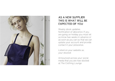
The concept of this initial Welcome Pack design by me was to refine existing work and aim to develop a more modern high-end finish. After all the Welcome Pack is probably one of the most important publications of the brand. The typeface of the brand Anderson Grotesk is kept simple in this design by only using a bold and light weighting and a larger scaled title and smaller scale body text kept consistent throughout. I will await my first feedback for this initial design before any further development.
Tuesday, 8 October 2019
Work Experience: The Clothing Lounge Interview
Before the interview process I had to complete two tasks, to ensure my capability and showcase the standard of my work. The tasks involved designing a Newsletter with supplied content and designing some form of packaging, so I chose a luxury bag. After sending in my designs it was requested that I scheduled an interview. One of the first questions the Director Sam Burke asked me was to explain my concept for these designs. I explained my concept was to fit into the brand guidelines as much as I was aware of visually at this stage and to create sophisticated minimal designs that showcase the brands high quality and success.
Sam's feedback on my designs was "I love them both and they fit with the brand so well." In all honesty I was preparing myself for some harsh criticism being this was my first real engagement with a client outside the Freelance environment. A day after my interview first thing I received an email from Sam saying how impressed she was with my interview and I was offered the job. Below are some of the questions and answers I gave during my interview.
My Design Outcomes
Telephone Interview
Why are you right for this role?
I love Fashion and would love a job to combine my love of fashion and skills I have acquired from studying Graphic Design. Also having attended New York Fashion Week I think I can bring that inspiration I gained from attending into this job role.
What are your strengths?
Editorial Design and Branding. I have always loved editorial publications so it is something I am interested in and from creating brands for my own Freelance clients it is definitely one of my strengths.
What are your weaknesses?
In terms of Graphic Design, I would say UI and App design purely because I haven't had much experience yet designing for applications.
Why do you want to join The Clothing Lounge Team?
As an already successful fashion company I would like to be able to learn how the industry works first hand. Whilst also combining my love of Fashion and Graphic Design as my job role.
Work Experience: The Clothing Lounge Communication Structure
Asana
Mail Chimp
Working for The Clothing Lounge has enabled me to engage with working as a team in industry. The Clothing Lounge use two main sites to engage in communication and the design process these include Asana and Mail Chimp. I have watched tutorials to familiarise myself before engaging with these platforms myself as both are new to me. My initial thoughts are asana is an effective platform to engage as a team, interact and let team members know what stage you are at, this is crucial within the design process.
Sunday, 6 October 2019
Something More : Feedback
Feedback received highlighted our group as confident presenters. Feedback was also very positive on the method of presentation, using social media platform Tumblr. The audience acknowledged this was a unique interesting way to present and worked well with the topic of 'cursors' we were presenting. The only considerations were inclusive of further development and how we could push the topic further.
How we worked as a group:
Overall the group worked well, everyone contributed and worked well as a team. It was nice to work with people I haven't worked with before. The work we produced in such a short time period reflected how well we worked together as a group. We produced high quality work due to working well as a group and effective time management. The group was well organised and managed amongst ourselves.
Something More : Preparing the Presentation
Preparing the presentation involved working together as a group to combine our contributions and add them to our presentation format, Tumblr. We chose Tumblr as an alternative more interesting way to present. Further preparation involved writing up a script which we worked well to do collaboratively as a group. My individual contributions can be seen below.
Tuesday, 1 October 2019
Something More - One Week Brief
The Brief: Present a mundane word in an interesting way.
Word: Cursor
Considerations: The word cursor in different situations, everyday, employment, transportation and romance.
Other considerations:
- Utilities or uses?
- What does it do for you?
- Slogan acronym e.g. 'k. e. r. b. s.'
- Description of objects to inform design
Other sources
- Empowering - TED Talk
- Surprise
- Event
- Unboring
Initial Thoughts:
We worked well together as part of a group and it was good to work with people we had not worked with before. The group worked well collaboratively with initial ideas and planned good time management. Initially we looked into the history and word associations surrounding the word 'cursor' Then it was discussed how we could make our topic and presentation interesting to an audience. Video methods, gifs, memes and alternative methods of presenting including Tumblr were discussed.
Something More Studio
- How you feel
- Have an impact
- Make something better
- Work with Hungry Sandwich Club collaboratively on projects
- Team of four people founded by three of them
- Collaborate with people better
- Never stop questioning what you are doing?
- Be uncomfortable
- What's the reason to exist?
- Research/look into York Mediale 2018, branding
- Challenge ideas and preconsumptions
- How work exists in real world
- Can designs be engaged with (interactive)
Thursday, 2 May 2019
OUGD505 End of Module Evaluation
This module has enabled me to build a body of work reflective of issues I feel strongly of in studio brief 2 and my interests in studio brief 1. This module also enabled me to consider alternative formats and experiment further with this.
The briefs set out were relevant and appropriate to develop my skills and build my design portfolio. I did reasonably well to balance my workload and manage my time, regularly updating my blog with research and reflection on my work which I aim to maintain.
The briefs set out were relevant and appropriate to develop my skills and build my design portfolio. I did reasonably well to balance my workload and manage my time, regularly updating my blog with research and reflection on my work which I aim to maintain.
I also think I have fulfilled a good learning potential although, I still think my work can continue to progress. But my overall learning throughout this module has helped my progression on the course. This includes the new skills I have learned and the greater focus on working collaboratively and with a client. The feedback I was given was helpful and really helped my work to progress throughout the module.
The tutors gave me great support by providing feedback. The assessment criteria were clearly explained and explained again closer to submission which was helpful. The Library and Print resources were very helpful due to the resource's equipment and workshops.
The tutors gave me great support by providing feedback. The assessment criteria were clearly explained and explained again closer to submission which was helpful. The Library and Print resources were very helpful due to the resource's equipment and workshops.
Tuesday, 30 April 2019
Printed Publication : Further Developments
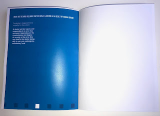
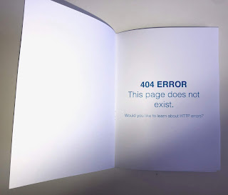
Feedback received encouraged me to still experiment with physical production method as this can relate more to the human element of the topic. Further experimentation explored deliberate errors in physical production in relation to binding, printing, trimming and layout. I mocked up three publications each with deliberate production errors seen below. Although these experiments and developments explored other format considerations and other ways of further visualising human error, the digital outcome was still most appropriate and successful in visualising the technological topic.
Errors: Cropped type due to trimming, layout, orientation and page order
Errors: Cropped type due to trimming, layout, page order
Errors: Cropped type due to trimming, layout, page order and digital error
SB2 Evaluation
The finally outcome successfully visualises the concept, with careful consideration into format and production ensuring the method of distribution was suitable and fitting of the design and initial concept. The idea could be further enhanced by creating a unique hashtag for the social media account allowing the audience to further engage with the topic and the publication. The colour typeface and layout successfully interprets the format of iBooks making the publication readable on a digital platform. The inclusion of errors makes the publication engaging and intriguing to an audience whilst working as an effective way to visualise the topic of human error through all the elements within the design.
The minimalist style aims to draw more focus to the errors which are minor or drastically notable throughout the publication. The format itself is basic as it takes reference from the standard uniform aesthetic of existing e-publications, like iBooks. The shape pattern along the bottom of the publication works well to visualise a narrative showing the reader where they are within the publication. Not only does the pattern visualise narrative it also visualises an abstract approach to human error by creating an abnormality of colour within a pattern. Other feedback encouraged experimentation with a printed format of the publication with deliberate errors in the production process through printing, trimming and binding.
Overall design decisions such as type, layout and colour are justified well by visual research references or references fitting of the concept and topic such as the NHS. The only possible development could be to consider how the message could also be delivered more physically, such as could the publication being printed create another method of distribution. Although this method opposes the digital element of the topic so perhaps this is not an appropriate considered development. Although due to this opposing the digital format of the topic this does create an intriguing alternative method of distribution and could create room for exploration.
Monday, 29 April 2019
SB2 Crit
Feedback received offered further consideration into the format and the method of distribution. The developed outcome is digital but feedback encouraged me to challenge the digital concept by physically producing the publication by printing it. To reveal the amended publication another page was added asking the reader did they spot the errors and to reveal the updated publication visit the Instagram page. The design itself received positive feedback as the aesthetic created the right balance between being designed and being informative. The design itself made the publication interesting and engaging to an audience. Further experiments with include exploring physical human error in the printed production of the publication. The printed publication will also make deliberate physical errors such as binding, trimming and the layout of the publication.
Further developments:
Further developments:
- Add see updated version page
- The design has a lovely aesthetic and balance between being designed and informative
- Social media is a nice progression
- Experiment with a printed version with deliberate physical errors
Subscribe to:
Comments (Atom)


