Illustration created using Procreate on iPad Pro - Inspired by typography in chosen context
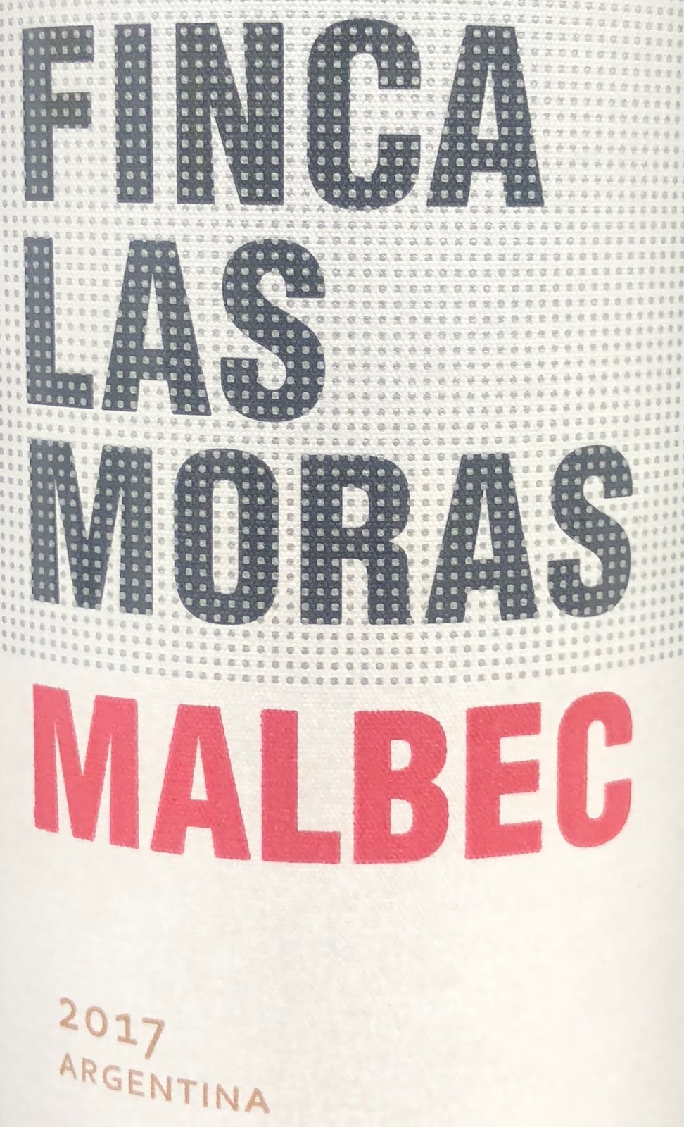
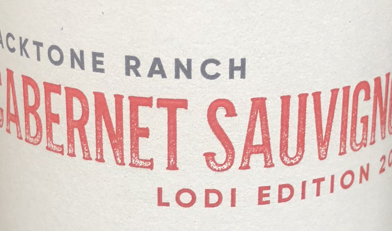
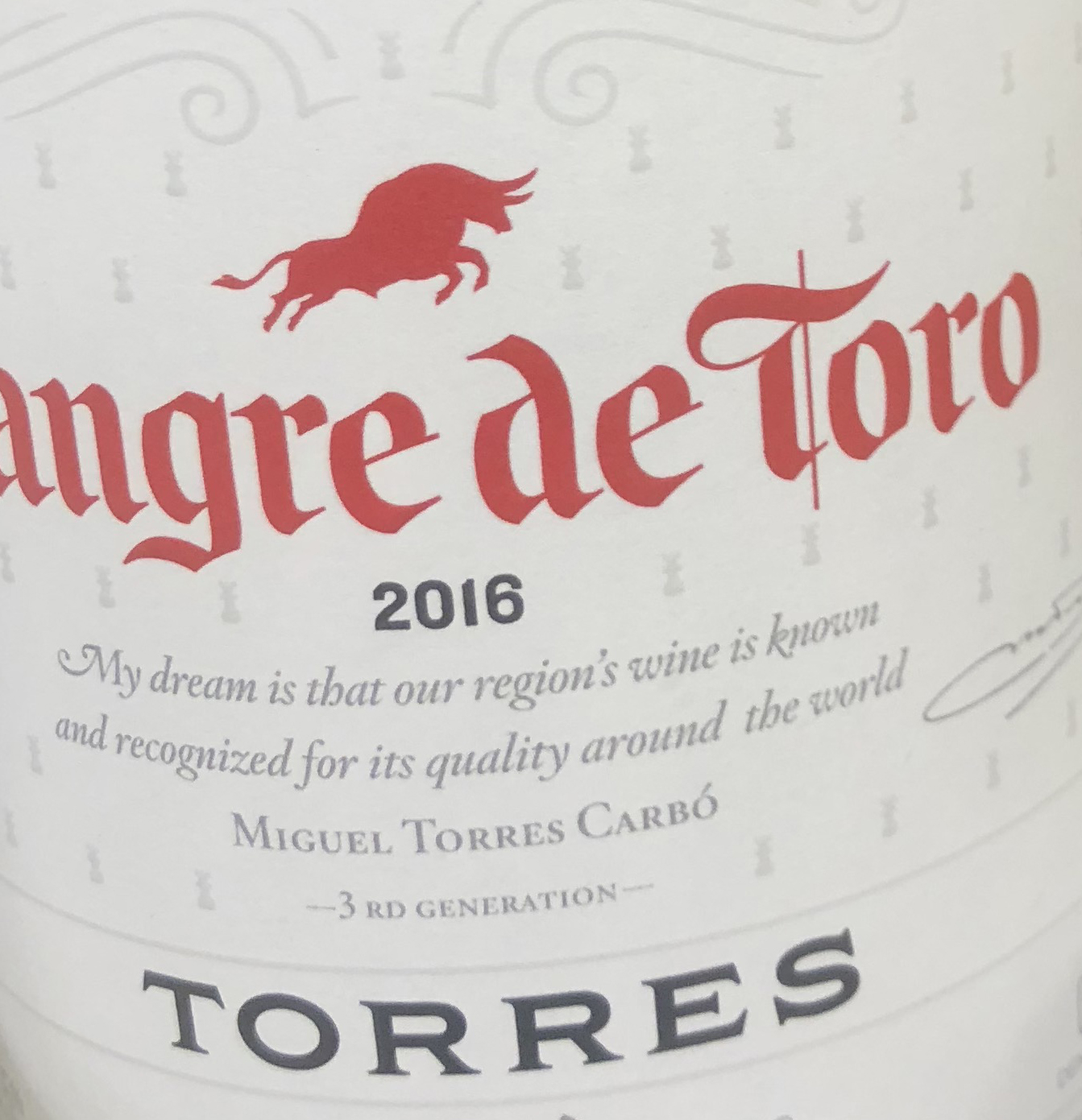
RED
WHITE
Focal points
-
Fit
for purpose
-
Common
style
-
Communication
effective
-
Justify
the context
-
Can
restraints be added
-
Legibility
-
Colour, consistency and kerning
-
Compatibility
The
context chosen for this project was wine, in particular different wine branding
typographies.
The
branding and typography help to visualise the type of wine. Often the price
range is also visible through the branding. This makes the typography in
context fit for purpose as it is an essential element in branding and visual
purpose.
There is
a common style where labels mostly contain a serif font paired with a
sans-serif. Weighting of typography also reveals a common trend. Bold or thick
stroked typography is often paired with a lighter stroked typography. Another
common trend demonstrates how a range of often three fonts are used in each
label of context. This most commonly includes two fonts or one with varied
weighting and a handwritten type. Looking at common styles also revealed
monochrome colour schemes are nearly always visible.
Therefore,
the most common colour scheme for typography is black or white text. The typography also demonstrated how all
block capitals are often used to visualise most of the main characters and even
sub headings, this could again be considered a technique to make the type
predominant. Often type is the most predominant feature in the context
selected. However, sometimes there can be symbolic, detailed or simplistic
imagery paired with the type.
The
typography is used to effectively communicate the theme and style of the wine. White
wines tend to use a lighter typography. Red wine is more commonly seen using a
bolder typography, this could be recognised as using type to visualise a
difference in darker wine.
The
context was selected due to the varying themes, styles and range of typography
offered to explore.
Restraints
could be added to placement and weighting during experimentation to see if this
alters the appearance and branding. Restraints to the placement of type could
be an interesting area to focus on, due to most type in context being placed in
a basic horizontal format. One of the source images displays an example of
this, by placing the type on an angled slant. This idea of varied placement
makes branding more interesting and the type more predominant.
It was
important to consider other elements associated with typography such as legibility.
As it is important type is legible in the subject of interest (branding).
Although legibility became challenged slightly with inclusion of a handwritten
typeface.
Single
colour is also seen to create a greater focal point to the typography. Colour
can also be used to symbolise a style or theme or sense. Masculine,
earthy tones and rough shapes can be used to describe a bitter flavoured wine.
Whereas feminine, soft and cursive tones can be associated the sweeter and
floral flavoured wine.
The type variations are consistent as
mentioned with two weightings or fonts. Broad or tight kerning can also be seen
to highlight the most predominant type on each label. The combinations of
different fonts and weighting must be compatible for the typographies to work
together harmoniously.
Results are as follows a typeface can make a
wine look and taste expensive. Labels with thin,
smaller-sized, contrasting typefaces or with serifs were associated with
expensive wine. In contrast, jagged, fat typefaces usually aren’t as fitting.
Looking at these typefaces visually felt uneasy, like rough edges.
Conclusion
Old wine labels
use traditional, busier typeface styles and design that link to history and
authenticity. This becomes a visual metaphor for what we assume will be the
experience of drinking the wine. The labels feature traditional serif typefaces
and formal script. Imagery is often engraved in style and can feature crests or
symbols of provenance. Colours are muted, with traditional shades and textures.
Whereas, new wine labels are essentially more entrepreneurial, and
representative of the modern technology used to make the wine. Contemporary,
uncluttered labels aim to appeal to the widest audience possible. Imagery is
often modern illustrative or photographic. Colours may be brighter, with
unusual textures, finishes or shapes.